Invitations For The Best Fall Wedding Color Themes
| Color Pair | Vibe | Best For | Invite Style |
| Burnt Orange & Sage | Earthy, Warm | Outdoor, Boho | Kraft Paper, Botanical Art |
| Burgundy & Blush | Romantic, Soft | Garden, Vineyard | Watercolor, Calligraphy |
| Navy & Copper | Bold, Chic | Evening, Modern | Foil Stamp, Geometric |
| Olive Green & Cream | Minimal, Clean | Nature-Inspired, Intimate | Deckle Edge, Line Art |
| Plum & Gold | Regal, Luxe | Black-Tie, Historic Venues | Velvet, Gold Foil |
Why Fall Weddings Just Hit Different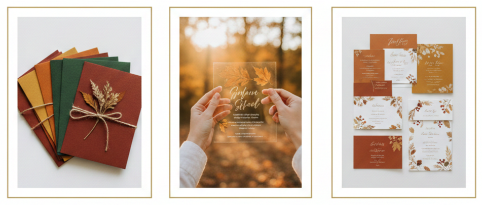
- Seasonal perks: Fall offers cooler temps, gorgeous natural scenery, and a calm atmosphere. You’re not fighting the peak-season crowds or heat.
- Venue flexibility: With fewer weddings happening, you’ll likely get better availability and pricing.
- Naturally stunning backdrops: Colorful foliage and golden hour lighting make for flawless photos and memorable moments.
Fall weddings allow you to create a relaxed, intimate vibe without sacrificing style or sophistication.
How Invitations Set the Tone
- First impressions matter: Your invitation sets the style of your wedding. It tells guests whether they’re heading to a backyard bash or a black-tie event.
- Color carries weight: The colors you choose create an emotional tone—rich, moody tones say formal and romantic, while lighter shades feel more casual and playful.
- Design details add depth: Typography, paper textures, and layout design all help show your guests what kind of experience to expect.
When your invites match your fall wedding theme, it creates a seamless and polished guest experience from the moment the envelope arrives.
Burnt Orange & Sage – Rustic Meets Modern
- Why it works: Burnt orange captures that crisp autumn vibe, while sage brings calm and balance. Together, they feel modern and grounded.
- Best for: Boho weddings, backyard celebrations, or anything outdoors.
- Design ideas: Use kraft paper or linen-textured cardstock to play up the rustic charm. Vellum overlays add elegance without being too flashy. Botanical sketches or terracotta line art give just the right hint of fall.
- Finishing touches: Wax seals in amber tones, twine, or deckle-edged paper can make your suite feel handcrafted but still refined.
This color combo fits right in with the earthy tones of the season while still feeling fresh and stylish.
Burgundy & Blush – Bold and Soft in Harmony
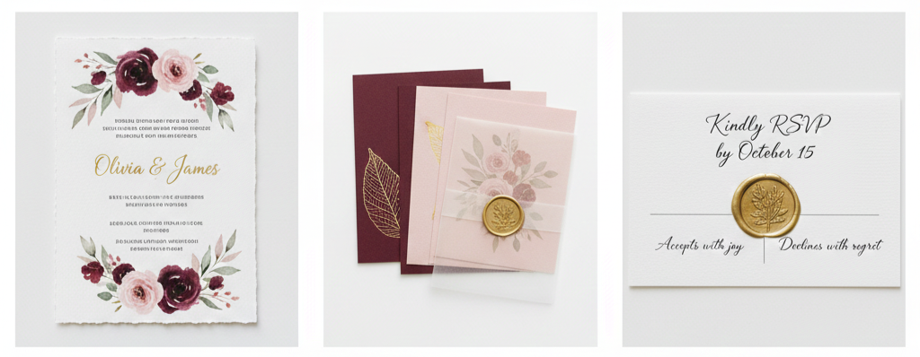
- Why it works: Burgundy brings richness and depth, while blush softens everything. It’s romantic and elegant without feeling stuffy.
- Best for: Garden ceremonies, vineyard weddings, or any event with a romantic flair.
- Design ideas: Choose cotton paper or thick matte cardstock for a luxe finish. Add gold foil or wax seals to level it up. Watercolor florals or minimalist vines blend these two colors perfectly.
- Font suggestions: Try a mix of calligraphy and serif fonts to balance boldness with softness.
The contrast of burgundy and blush makes a strong visual impact while staying timeless and graceful.
Navy & Copper – Evening Elegance With Edge
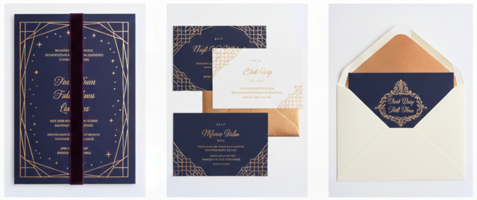
- Why it works: Navy feels structured and cool, while copper adds just the right amount of warmth and shimmer.
- Best for: Evening weddings, rooftop venues, or formal events.
- Design ideas: Go for navy cardstock with copper foil stamping. Geometric designs or a starry night motif look amazing in this combo. Metallic envelope liners give a luxe feel right away.
- Typography tip: Keep fonts clean and minimal for a modern, sleek look.
This pairing gives your invitations a stylish edge that’s perfect for fall’s deeper, moodier side.
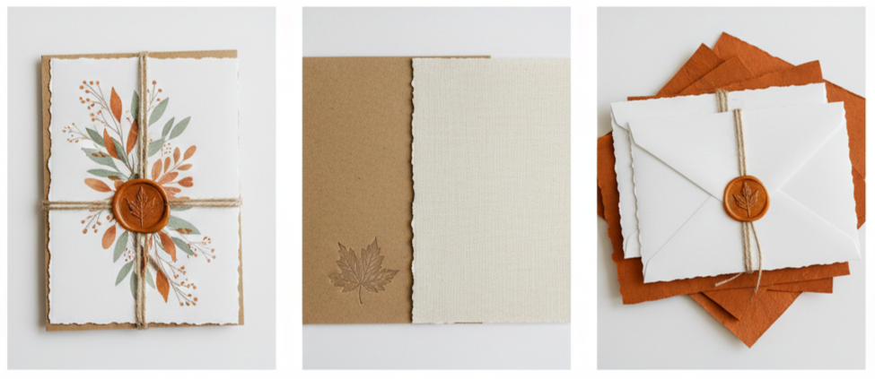
Olive Green & Cream – Simple, Clean, and Timeless
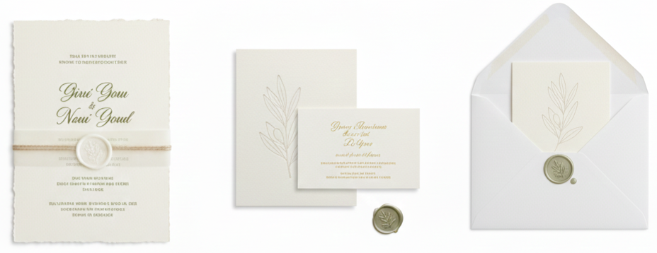
- Why it works: Olive green brings a grounded, natural tone, while cream keeps things soft and minimal.
- Best for: Minimalist weddings, nature-focused themes, or intimate ceremonies.
- Design ideas: Try deckle-edged or soft cotton paper. Simple serif or sans-serif fonts keep it clean. Line drawings of leaves or subtle embossing work well here.
- Minimal details: Stick with vellum wraps, light twine, or tiny wax seals for a subtle finish.
If you want understated and elegant, this is a great way to lean into the season without being loud about it.
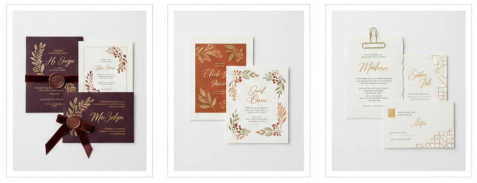
Plum & Gold – Bold and Regal With a Touch of Glam
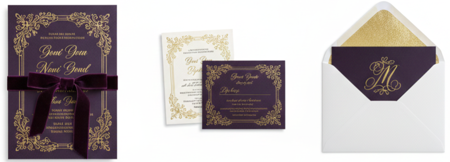
- Why it works: Plum is deep and regal, while gold adds the shine. It feels rich, romantic, and luxurious.
- Best for: Black-tie weddings, historic venues, or anything upscale and dramatic.
- Design ideas: Use plum cardstock layered with gold foil or metallic printing. Velvet ribbons or ornate borders turn up the drama. Baroque-style artwork and gold calligraphy complete the look.
- Envelope styling: Go for gold-lined envelopes and thick card layers to give it that regal, extra-special feel.
Plum and gold say “special occasion” loud and clear—and your guests will remember it.
Tips for Designing Fall-Themed Invitations
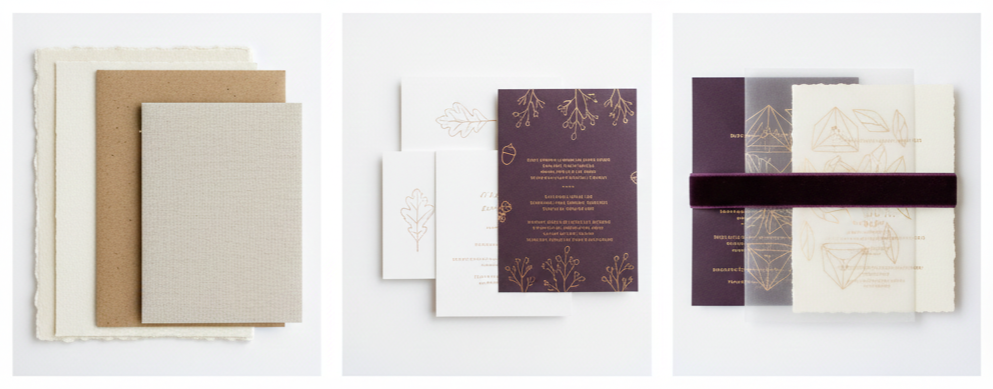
- Choose rich materials: Use linen, recycled kraft, or cotton paper with weight and texture.
- Incorporate seasonal touches: Think leaves, branches, or subtle fall icons like acorns or pinecones. Don’t go overboard—less is more here.
- Use layering for depth: Belly bands, translucent vellum, and backer cards can make your invite suite feel complete and elevated.
- Pick your print method carefully: Letterpress, embossing, or foil stamping work beautifully with fall tones and add visual texture.
Good design doesn’t need to be over-the-top. Keeping things cohesive and intentional goes a long way.
Where to Shop for Fall Wedding Invitations
- Online platforms: Minted, Zola, and Etsy offer tons of customizable templates. You can tweak everything from color to font and even paper type.
- Local stationers: Working with a local designer gives you more control. You’ll get samples in person and a more tailored experience.
- Freelance designers: If you want something completely unique, go for an independent artist. Provide them with a mood board and key details so they can capture your style.
Wherever you shop, make sure your colors, wording, and design align with your wedding’s personality. Consistency always looks more thoughtful and polished.
When to Order and Send Fall Wedding Invitations
- Order timeline: Place your order 4–6 months before your wedding. This gives you room for edits and any printing delays.
- Mailing timeline: Send invites out 6–8 weeks before your wedding day. That way, guests have time to RSVP, plan travel, and get excited.
- Save-the-dates: These should go out 6–8 months ahead, especially for destination weddings or major holiday weekends.
- RSVP deadline: Set your deadline about 3–4 weeks before the wedding so you can lock in the final headcount.
Planning ahead keeps things stress-free and gives your guests a clear heads-up.
Conclusion
Fall is full of design inspiration—from earthy tones to dramatic metallics. Whether you’re drawn to deep plum or soft sage, your invitation suite is the perfect place to introduce your wedding’s personality. Using the right colors, thoughtful design details, and seasonal touches helps everything feel cohesive from the first moment guests open the envelope.
Key takeaway: Fall wedding invitations aren’t just pretty—they’re powerful. When your invite matches your fall theme, it sets the stage for everything to come and gets guests excited for your day.
FAQs
What’s a unique fall wedding invitation idea that doesn’t use leaves or pumpkins?
Try using textured paper, warm color gradients, or abstract illustrations instead. You can also use velvet details or foil accents for a subtle seasonal vibe.
Can I use a fall color palette for a non-rustic wedding?
Yes. Fall colors like navy, gold, or plum can look incredibly polished and elegant, especially when paired with luxe paper and clean typography.
What font styles work best with fall wedding colors?
Serif fonts give a timeless and romantic look, while clean sans-serif styles work well for modern invitations. Calligraphy adds softness to bolder palettes.
Do I need to match my save-the-dates to my invitations?
Not necessarily, but keeping a similar color scheme or font style helps everything feel cohesive. Even small connections tie the look together.
Are digital fall invitations a good option?
They work well for informal weddings or as save-the-dates. Just make sure the design still reflects the tone and season with rich colors and high-quality visuals.
Leave a Reply